Six ways to sustainably improve accessibility on your site


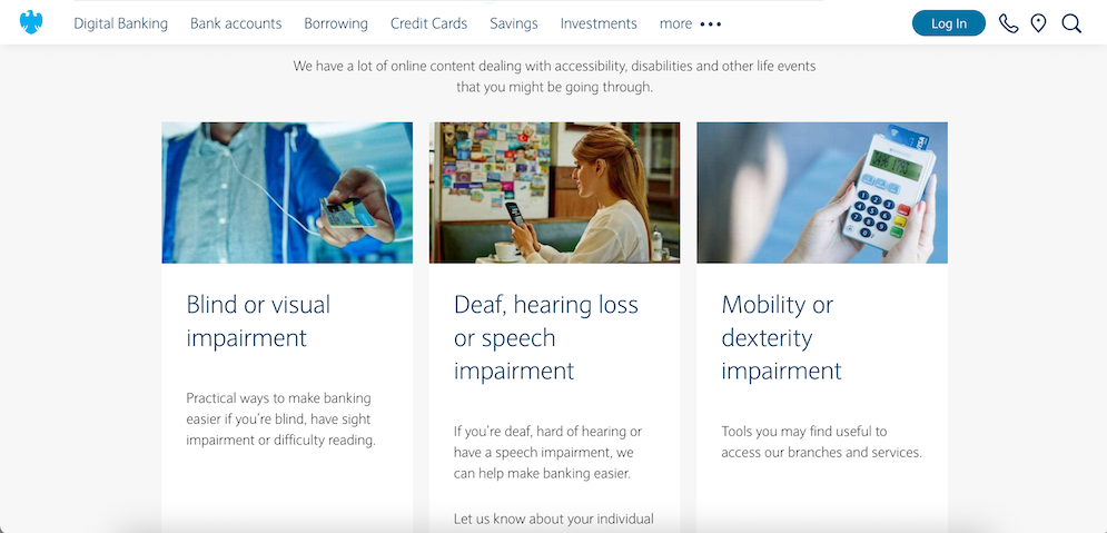
Barclays' recent accessibility content
Now that companies are being sued or fined for not taking accessibility seriously enough, digital managers need to take tangible action on their sites. Doing accessibility well also happens to be the right thing to do on behalf of the 16% of the global population with a disability. But where should you begin?
For those who haven’t prioritised accessibility up until now, it’s easy to see the appeal of the various third-party-branded accessibility overlays that have been appearing on many corporate and commercial websites lately. These tools promise an instant fix to a hard problem.
It’s a nice idea, and some of the new tools are nifty to use. But when these tools sit atop a site with deep inaccessibility in the structure and code, they aren’t really making things better. A case in point: people who rely on screen readers need to be able to navigate your site contents easily using their preferred tool. This requires careful choices in the way information is structured and tagged. Offering custom controls in an overlay will not do such a visitor any good, even if it fools the regulators or your boss in to thinking it does.
I recently spent some time with an accessibility consultant from the non-profit organisation AbilityNet, trying to better understand what true good practice looks like in this space. I came away from those conversations with a richer appreciation of just how intricate this discipline is – and also a renewed belief that anyone who applies themselves and asks the right questions can become better informed.
Here are six ideas to take accessibility forward on your site:
1. Publish an “Accessibility” page, or update your existing page
Offering a page on accessibility is an important trust signal and a better starting point than the off-the-shelf overlays. Your page doesn’t have to be complicated to make a difference. The very best such pages on the corporate web are clear, thorough, honest and regularly updated. Note how the Accessibility area on Barclays’ UK website speaks directly to a variety of audiences, and how Hydro’s Accessibility page is transparent about the aspects of accessibility that are still a work in progress.
2. Appoint an accessibility advocate within your team
One company Bowen Craggs works with has made big leaps in accessibility best practice by setting up a digital accessibility taskforce focused on raising awareness and advocating for change throughout the organisation. Consider asking one person in your team to commit to doing the same on a smaller scale, then provide training and support to help build up their expertise. AbilityNet offers free learning resources and paid-for training modules via its website.
3. Ask employees for feedback
Accessibility is ultimately about people, not technical compliance for its own sake. Within your organisation there are almost certainly employees with a variety of accessibility needs. Consider reaching out to a few such individuals through HR or the company’s employee resource groups and asking them for feedback on the corporate digital channels. Set priorities for improvement based on any weaknesses they highlight.
4. Give your heading tags some “tough love”
Heading tags (H1, H2 etc) are fundamental for people who interact with a site via assistive technologies. I’m constantly amazed, when doing the checks that Bowen Craggs uses to assess accessibility during our benchmark reviews, by how often these tags are poorly or inconsistently used. You can check your site’s performance easily by plugging a few page URLs into the WAVE app and clicking the “Structure” tab in each case. Each page should have one H1 tag on the main heading supported by an orderly sequence of H2 and H3 and so forth on supporting headings. Having more than just a few of these tags on a page can be problematic even if the ordering is correct; it usually means things which aren’t headings have been given a heading tag – diluting the whole point of the tags. If your headings need work, start with the most visited pages on your site. Educating section editors on good practice could be a fruitful next step.
5. Revisit your new-windows policy
At Bowen Craggs, we have long advocated setting offsite links to open in a new window or tab, to reduce disorientation. Seen through an accessibility lens, however, this technique can actually cause disorientation for some visitors, including those who “have difficulty perceiving visual content” (to quote a World Wide Web Consortium guidance note). The solution seems to lie in using new windows or tabs more sparingly and with utmost care. Whatever policy you decide on, consistent execution and clear signalling around what will happen when a visitor clicks or taps an offsite link remain as important as ever.
6. Implement a dark mode
Dark modes like the ones now provided by Nestlé and Sky Group are often pitched as climate initiatives, but there is arguably an even bigger accessibility impact. Visitors who prefer darker web pages because, for example, bright or busy pages hurt their eyes, can opt for dark-mode settings on their devices – but they’ll get a better experience if the dark-mode features have been properly designed, at source. Some advanced CMS packages allow light or standard templates to be converted to dark mode more or less instantaneously, which could make this a quick win.