Overcoming digital mistakes in the pharmaceutical industry

Best practice to go beyond the platitudes and demonstrate your company's distinctiveness
When visitors arrive on pharmaceutical company websites, they are likely to be greeted with promises of innovation, corporate messaging about creating a healthy planet, and images of smiling patients. If pharmaceutical companies do not delve any deeper than this, the risk is that these images and messages will be seen as clichés. As a result, websites become interchangeable in visitors’ minds, and you lose the chance to make your company’s best-selling points stand out.
Here are four of the biggest mistakes we see on pharmaceutical company websites, and best practice examples of how to overcome them.
Mistake 1: Innovation messaging with no follow through
“Innovation” is a message that pharmaceutical companies frequently promote, but many companies do not follow through with evidence. Rather, bold statements such as “Our company’s game-changing innovations” invite visitors to engage, but aren’t substantiated. This will almost certainly frustrate key audiences you are trying to win over, such as jobseekers and investors.
Best practice: Roche – A striking Innovation section with evidence-based claims
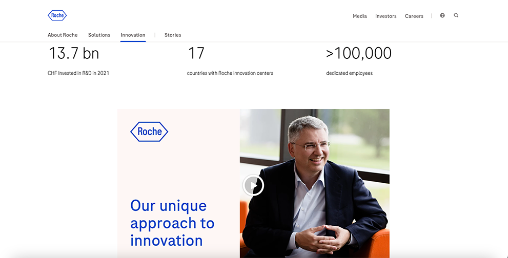
Innovation section on the Roche corporate site
Roche do not just claim to be innovative; they show their innovation in action. There is a transparent and impactful Q&A-style video of the CEO, which succinctly answers questions about the company’s R&D approach. Pages on ‘Team & structure’ and ‘Innovation process’ make effective use of infographics and layouts to support their innovation claims with evidence. Further insights into Roche’s ‘Group Innovation Engines’ and their ‘Innovation Process’ take visitors through the steps it takes to come up with new products.
Mistake 2: Smiling patients that stand in for authenticity
Images of smiling patients are a recurring visual cliché on pharmaceutical sites. Though it may appear to be an effective messaging tool – happy patients suggest successful treatment – this is not always the case. When visitors see the same images across all pharmaceutical sites, they risk coming across as inauthentic. Companies that make this mistake overlook the value of more challenging but realistic experiences (and potentially more engaging) stories.
Best practice: Novo Nordisk – Featuring realism in patient images

Patient imagery on the Novo Nordisk corporate site
Novo Nordisk is a company that goes beyond the clichés with its imagery, from the home page to deeper in the site. Yes, some patients are smiling, but that is of course ok, with a balanced, editorial approach. The company demonstrates its commitment to patient support with extensive statistics, maps of facilities and data.
Mistake 3: Indistinguishable sustainability goals
“Healthy planets” and “healthy people” are staple sustainability goals on pharmaceutical websites. These slogans may be out of the corporate digital team’s control, but if you find your company adopting the same top-level messaging as your competitors, it’s worth watching how you bring this to life on your digital channels. You can rescue an indistinctive sustainability message, by rooting the rest of your communications in facts instead.
Best practice: Pfizer – Addressing the specifics
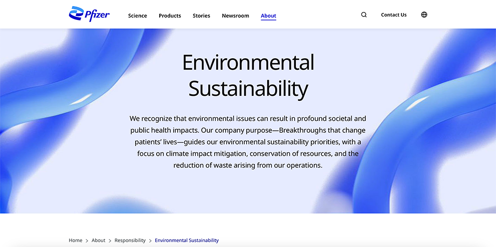
Pfizer's 'Environmental Sustainability' section
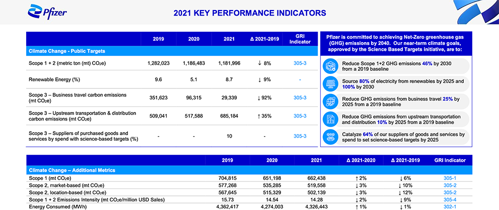
Pfizer's corporate site provides detailed performance metrics
Pfizer’s ‘Environmental Sustainability’ section goes beyond clichés and focuses on explaining its policies with facts and statistics. Clear goals – “climate impact mitigation, conservation of resources, and the reduction of waste” – are set out in the section overview, and performance-based action plans support them. A useful FAQ-style subsection on ‘Sustainable Medicines’ anticipates queries and provides clear signposting to further information. A separate ‘Performance Metrics’ PDF has detailed CSR-related data to support the company’s projected targets.
Mistake 4: Missing signposts for healthcare professionals, caregivers and patients
Patients, caregivers and healthcare professionals will often struggle to find relevant product and services information on pharmaceutical corporate websites. This is because marketing regulations vary worldwide, and companies interpret these regulations differently. Our visitor research clearly shows the presence of these audiences. They should be clearly directed to relevant, localised information where possible, as well as an explanation of what can and cannot be offered. It may be possible to work with regulators to find out what is permissible or not, while still ensuring audiences are served.
Best practice: GSK – clear routes to local information
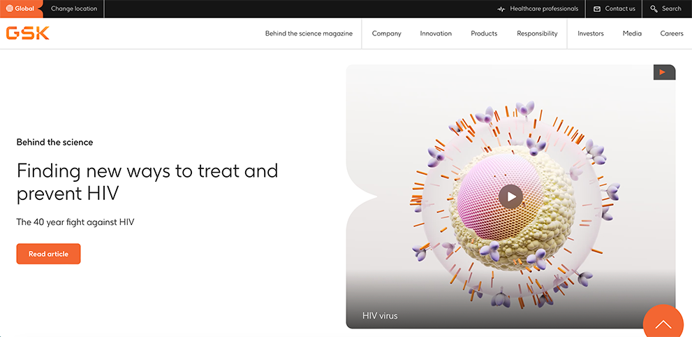
Landing page on gsk.com
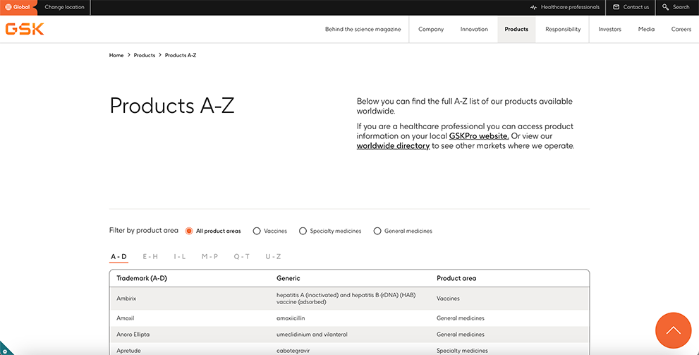
GSK's ‘Products A-Z’ subsection
GSK provide clear routing to the local version of the company’s GSKPro network of specialised sites, where localised, regulation-specific information is accessible for healthcare professionals. This is achieved via a link in the header, and this link is also available in the ‘Products A-Z’ subsection. For patients, a route from the corporate site to the worldwide directory is provided, where they can access local information or sites, subject to regulations.
In conclusion, although we often see these mistakes on pharmaceutical websites, digital teams can overcome them with clear signposts for all visitors, prioritising real-life shots over staged imagery and basing corporate messages in fact.