Overcoming digital communication mistakes in the financial services industry

The corporate websites of many financial services companies risk becoming interchangeable to visitors. Opting for indistinct and dated colour schemes, using the same banners on home pages, and failing to address common criticisms within the industry are all contributing factors.
Here are four of the biggest mistakes we see on financial services company websites, and best practice examples of how to overcome them.
Mistake 1: Similar colour schemes undermine attempts to be distinctive
Often, bank and insurance companies opt for the same blue-grey colour schemes in an effort to be visually sleek. The problem is that blue and grey is over-used in financial services, and for that reason, it can make your digital communications appear monotonous and repetitive. It gets to the point where digital estates blur into one. Choosing more vibrant colours will help your company stand out and be remembered. Even if you’re brand colours are blue and grey, and you cannot change them, work with your internal brand guidelines to try to bring more life to layouts and inject different colours whenever you can.
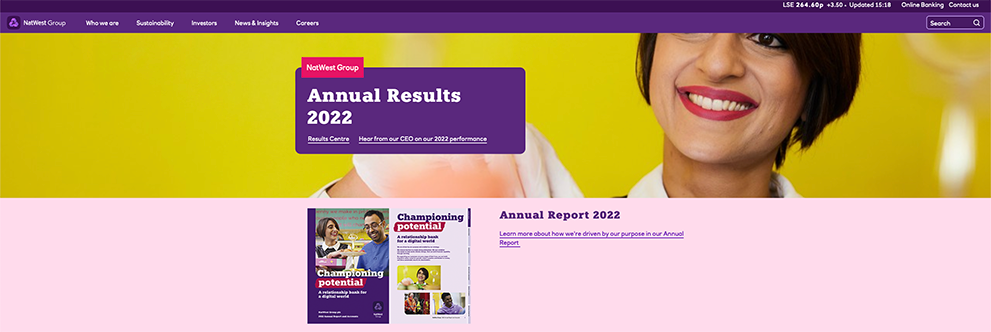
Best practice: NatWest Group – A playful mix of colours injects life into the company’s corporate image

NatWest Group’s home page, featuring a bold choice of colours
NatWest Group opt for purple, yellow and pink as a way of bringing a fresh, fun feel to the site, which has recently had a visual refresh. This choice of colours emphasises NatWest’s brand colour (purple) while supplementing it with contemporary, uplifting colours. Though content is similar to content found across financial services – signposting of the annual report, CEO remarks (see below) – NatWest achieves a brighter, more welcoming visual impact. There is also good continuity now and brand cohesion with NatWest’s retail sites.
Mistake 2: Predictable content on home pages fail to bring the company to life
Though linking to the annual report or the latest CEO statement on the home page is often important and unavoidable, it is time to reconsider whether they always need to take up the entire banner. The home page banners across the financial services industry often look identical when it comes to the content they promote. Primary banners read ‘Full Year Results’ or ‘Annual Report’, leaving unique (and potentially more interesting) content pushed further down the page. This is a missed opportunity to use valuable home page real estate to tell visitors something distinctive about your financial services company.
Best practice: Goldman Sachs promote their podcast on the home page

Goldman Sachs immediately links to their company podcast
Goldman Sachs uses this key space to showcase their podcast ‘Exchanges at Goldman Sachs’ to their visitors. Prioritising informative and unique multimedia over PDF reports leaves visitors with a striking impression of the company and brings to their attention something they may not have seen before.
Santander – Innovative use of home page imagery to shape company perception

Santander’s striking use of imagery and headlines
Santander’s innovative use of imagery and headlines to promote sustainability messaging has an instant impact and most importantly, stands out from most financial services banners. There is a small link to the ‘2022 Annual Report’ – so still visible for those audiences who are interested – but appropriately placed so it does not overwhelm the page and risk looking like every other banking home page.
Mistake 3: Unclear routes for business customers who are looking for sophisticated products and services
Business customers looking for more sophisticated services such as reinsurance or complex investment products are often neglected on banking and insurance websites: sometimes the navigation is unclear and there are no overviews. Usually, companies bury fragmented information within ‘Who We Are’, and this may lead to a microsite or a webform, both of which can be unclear and unfriendly. Frustrating these visitors is risky – you may be losing sales or confusing your most lucrative customers. It is important to ensure all potential customer visitors have relevant signposts to the products and services they are interested in.
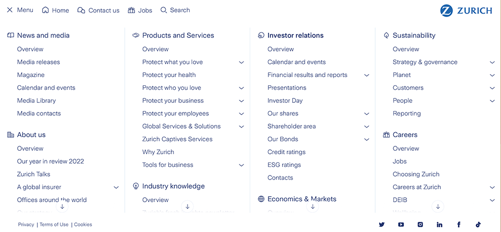
Best practice: Zurich neatly lays out its sophisticated insurance products

Zurich’s main menu, with ‘Protect your business’ highlighted
Zurich, within the ‘Products and Services’ section of their menu, clearly signposts all of its insurance products under ‘Protect your business’ and ‘Protect your employees’. This is a logical way to frame these routes, and contact information is provided throughout, with the relevant tertiary pages listed.
Mistake 4: Failing to tackle common criticisms head-on
Whether it’s investment in fossil fuels or discussing money laundering, financial services companies are reluctant to address these issues in their digital communications, even companies that otherwise perform well in the Bowen Craggs Index. The typical approach is to address net zero plans and promote a commitment to sustainable investing, but go quiet when it comes to controversies. Or, if controversies are addressed, it is through a list of legalistic policy PDFs or ‘statements’. Maybe it is no surprise that an industry dedicated to risk management is so risk averse, but stakeholders and regulators want financial services to go further than that.
Best practice – look outside financial services
There is a lack of global best practice for controversy communications amongst financial services companies in the Bowen Craggs Index. For inspiration, financial services should look to the controversial sectors it invests in. See for example Glencore’s ESG A-Z and other examples amongst Index top performers. Financial services may be at one remove, and not engaged directly in mining or oil drilling, for example, but stakeholders and the public increasingly see little difference between the companies conducting these operations and those doing the financing.
In conclusion, though these mistakes are commonly found across the digital estates of financial services companies, they can be overcome with a commitment to transparency (especially regarding past and current controversies), clear signposts for all visitors and a focus on using interesting visuals to allow your company to stand out.